TL;DR
- A lightweight budgeting companion built around a real behaviour: people check their finances in short moments, not long sessions.
- The goal is to reduce month-end surprises by making two things obvious early — where the month stands right now, and which categories are pushing it off track.
- Calm by design: it measures and surfaces change but avoids judgement and aggressive advice — the only thing allowed to interrupt the calm is an actual overspend.
The Challenge
Cleary's goal is simple — reduce month-end surprises by surfacing where the month stands and what's pushing it off track. Four behaviours get in the way:
- The month feels fine — until it suddenly doesn't. Users notice overspending too late because totals hide where the drift is coming from.
- Budget lists don't tell you what deserves attention. “Spent / limit” isn't prioritisation; users need a clear signal for on-track vs. overspent.
- Budgets stop working when transactions are miscategorised. Even good auto-categorisation needs correction — if editing is slow or disconnected from impact, users stop trusting the budget.
- Subscriptions are easy to forget because they feel small. Recurring costs don't feel urgent but they accumulate; users need a compact snapshot to stay aware.
Every one of these is a point where a budgeting app usually reaches for alarm. Cleary's bet was to stay calm and still make the problem unmistakable.
The Solution
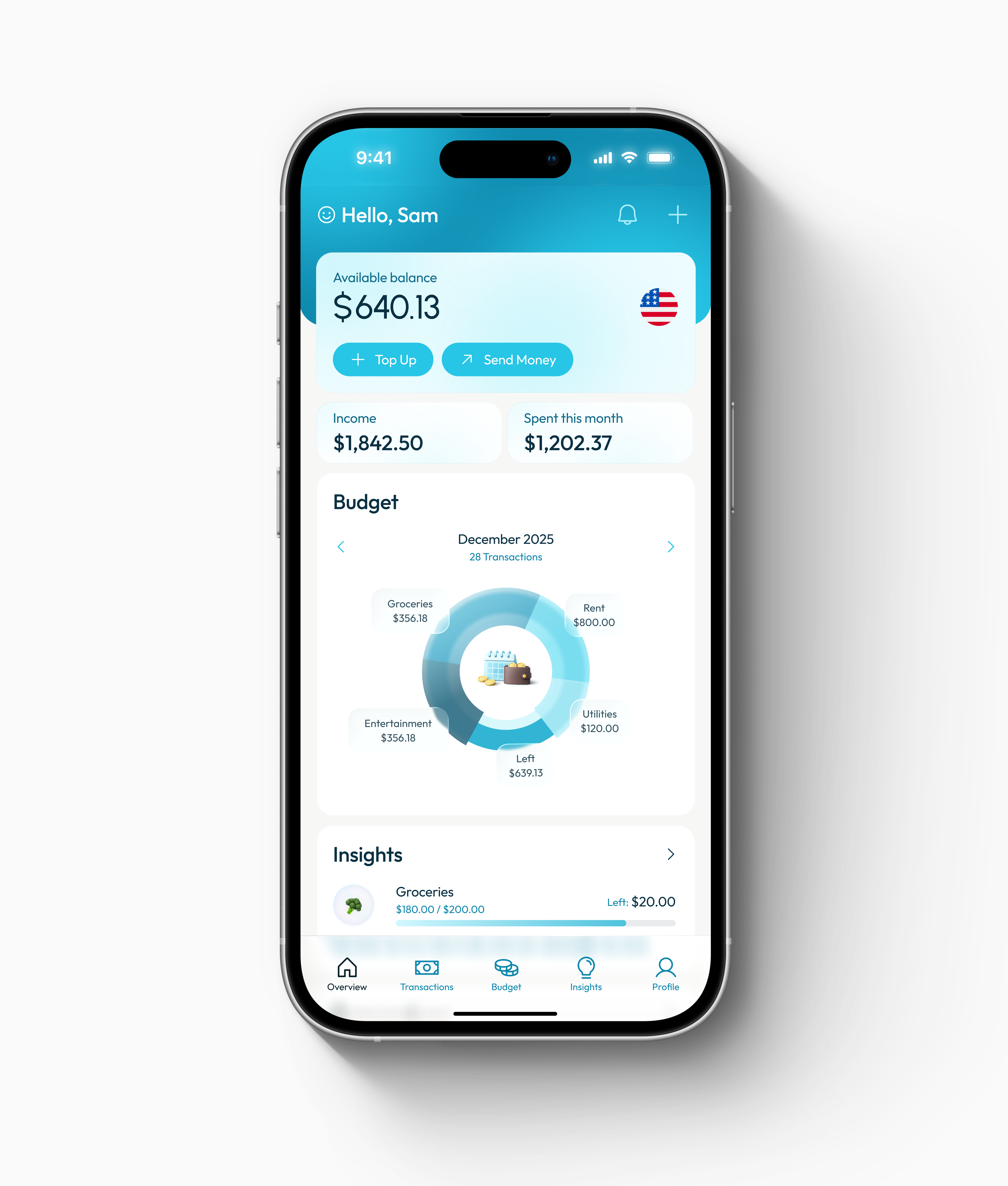
- Framed the product around a real behaviour. People check finances in short moments, so Cleary optimises for the quick glance rather than the long session — reducing month-end surprises by making two things obvious early: where the month stands, and which categories are pushing it off track.
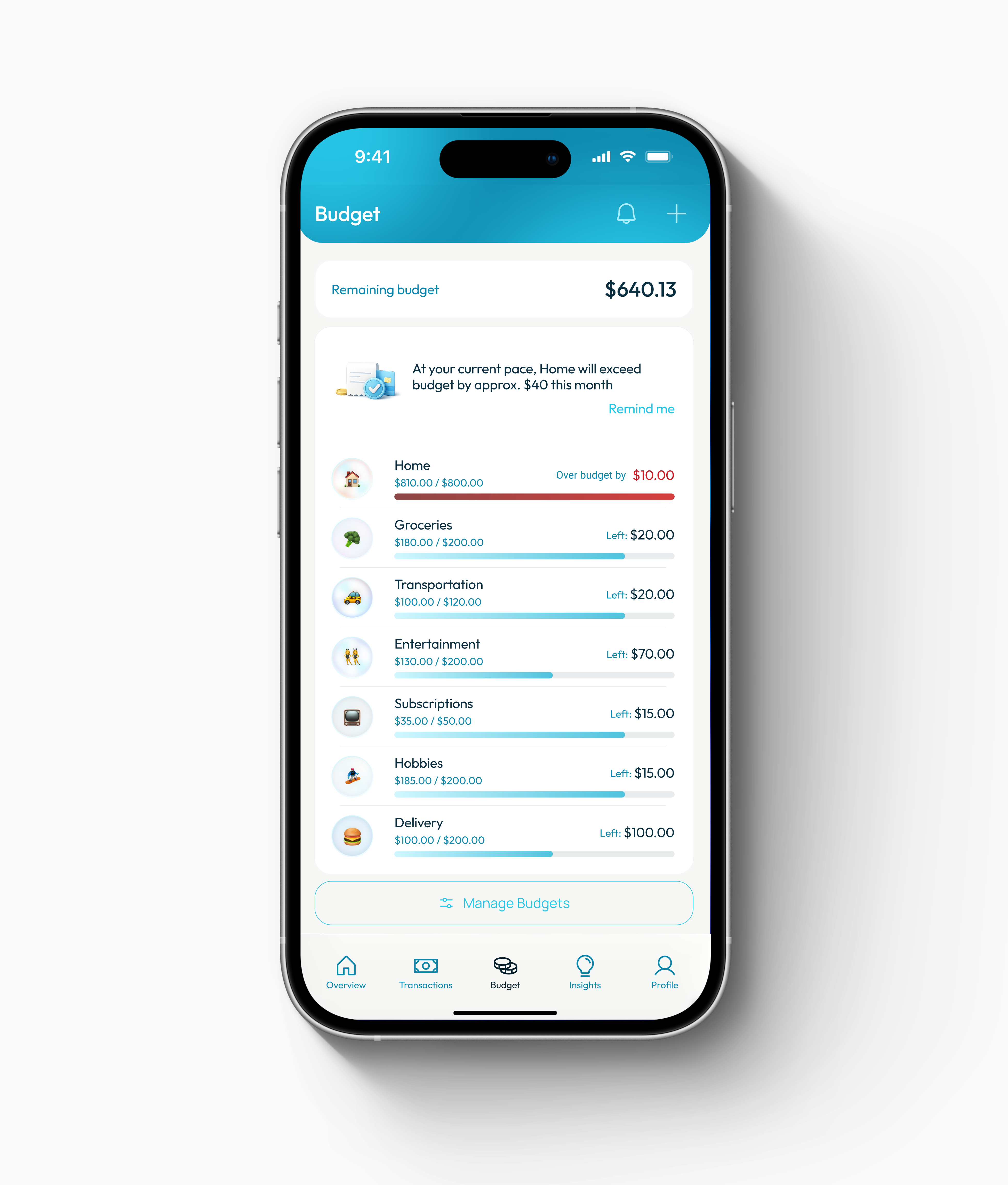
- Made calm the default, with one deliberate exception. A restrained system where everything is neutral — one accent colour reserved for interactive elements and key data — and red reserved only for overspend, applied minimally (label + bar, never full-card alarms). The UI avoids judgement; prioritisation itself is the meaning.
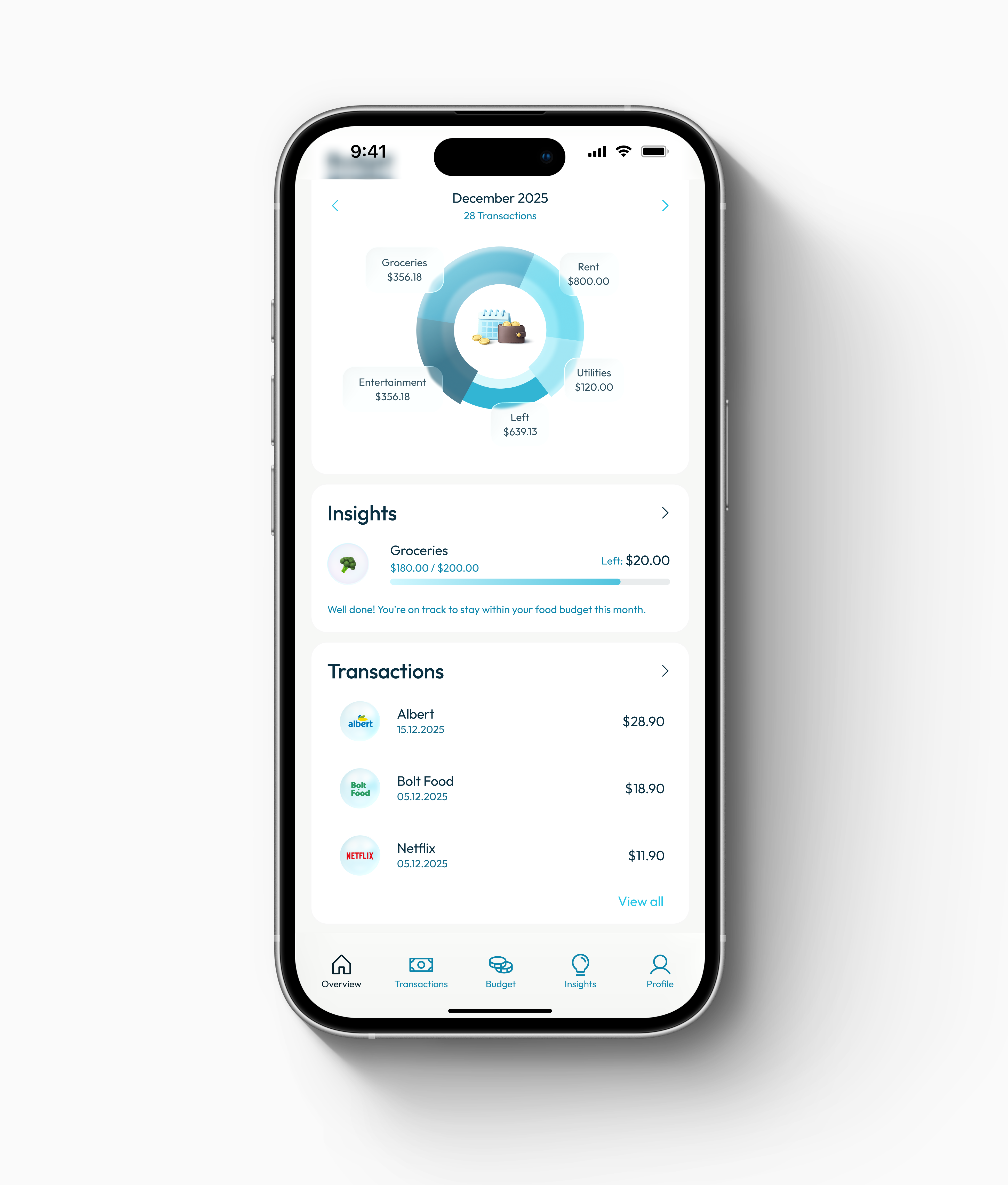
- Used a consistent UI system and purposeful motion to carry comprehension. One card anatomy across screens (padding, radius, shadow, header spacing), charts used only for comparison rather than decoration, and motion that does a job — progress fills read budget usage instantly, number transitions make status changes feel intentional, and transitions preserve context between list and detail.
Key Decisions
-
Status first, details second
- Problem
- The first screen has to work in seconds — if it needs reading, it fails the quick-check use case.
- Decision
- Overview is built around a small set of monthly metrics, with previews that route into Budget and Transactions.
- Where
- Overview
-
Let overspend be the only thing that interrupts the calm
- Problem
- “Spent / limit” lists don't tell you what deserves attention.
- Decision
- Budget uses a restrained system where everything is neutral except overspent categories, which get a clear semantic state — prioritisation without a lecture.
- Where
- Budget
-
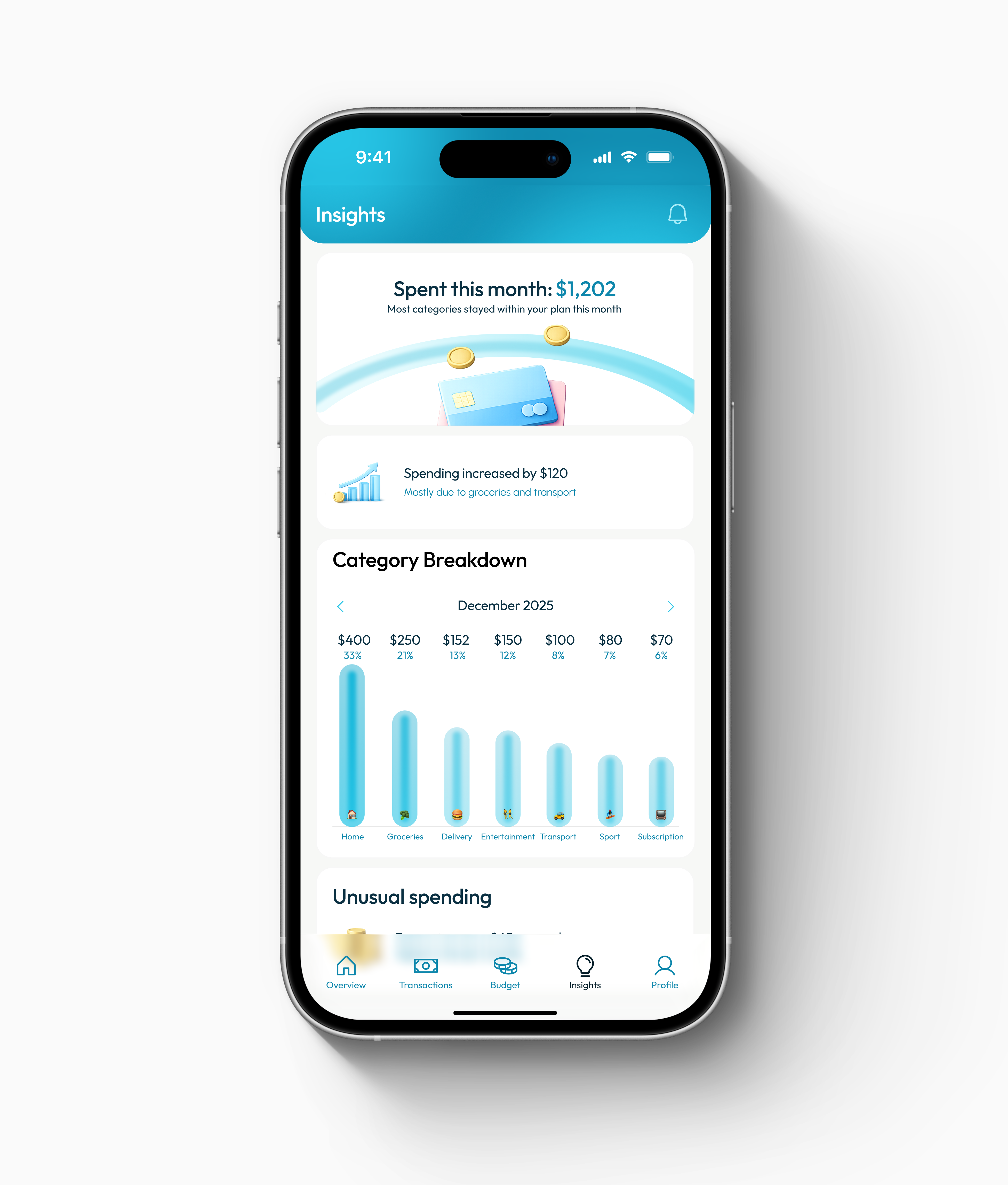
Made Insights earn their place by explaining “why”
- Problem
- Without new information, an “insights” tab becomes filler.
- Decision
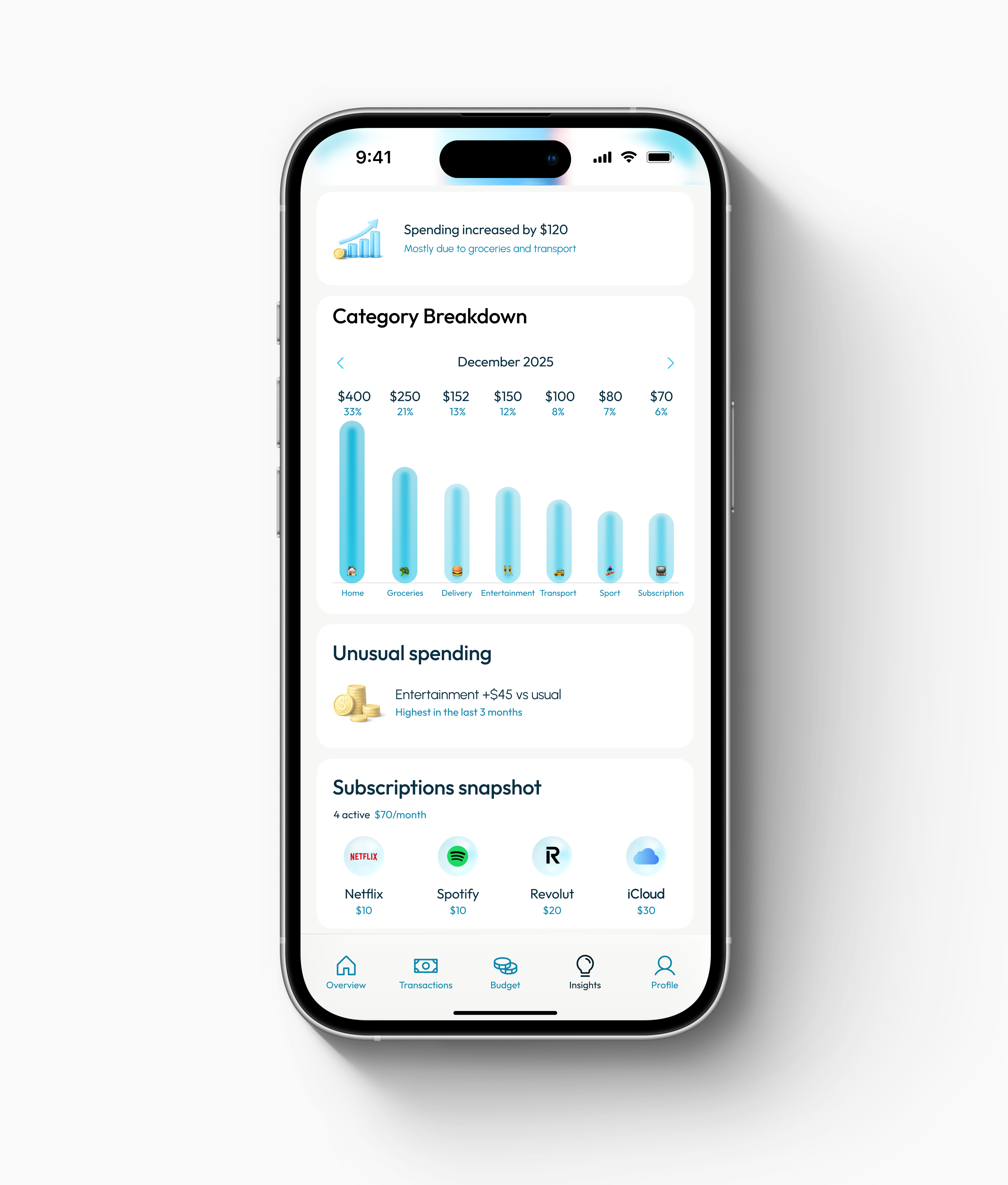
- Insights holds only what Overview and Budget don't already show: a monthly spend anchor, change vs. last month, a comparative category breakdown, a single unusual-spend standout, and a subscriptions snapshot — analytical without becoming dense.
- Where
- Insights
-
Made corrections fast, and showed the consequence
- Problem
- Budgets stop working when transactions are miscategorised and editing feels disconnected from impact.
- Decision
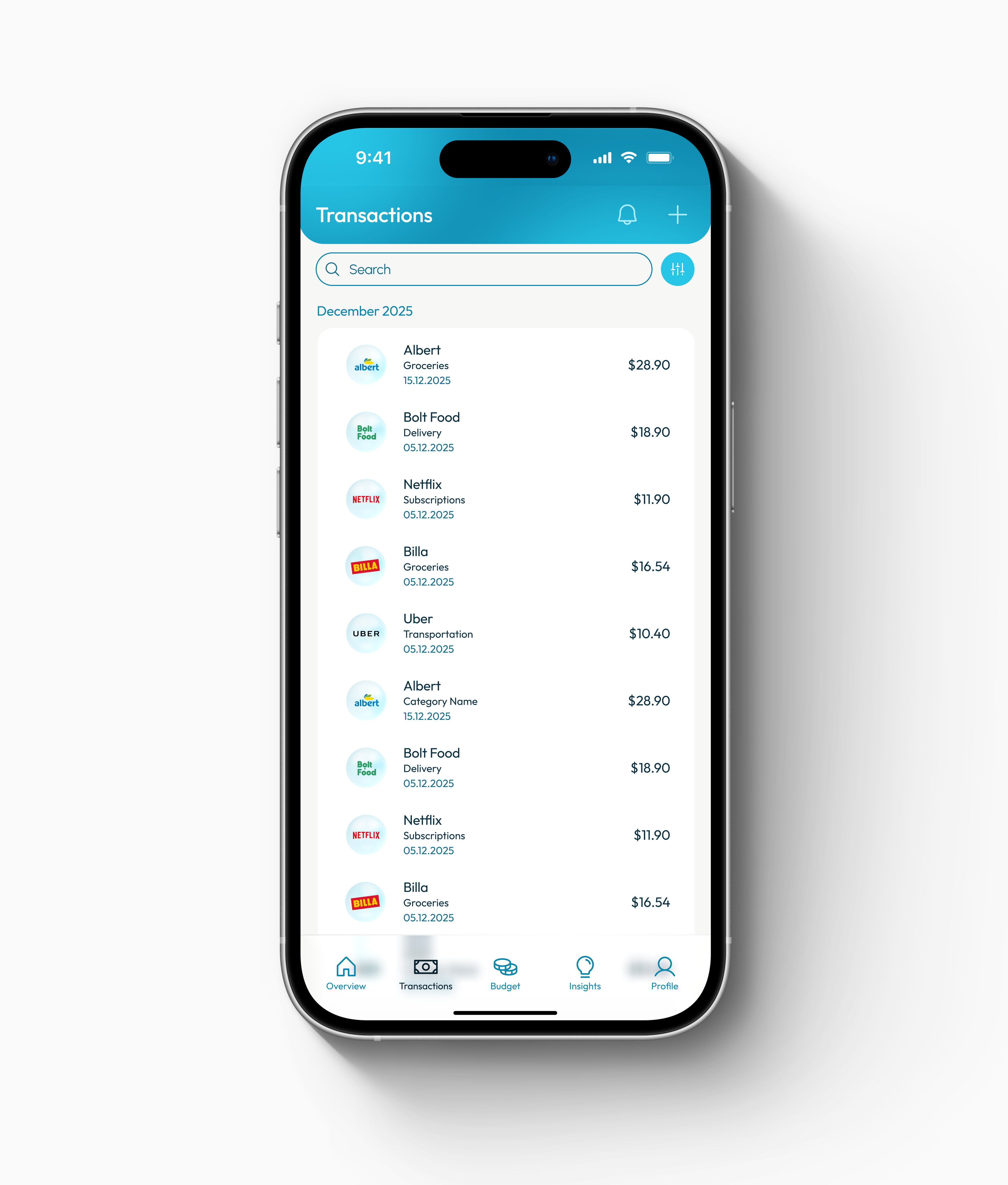
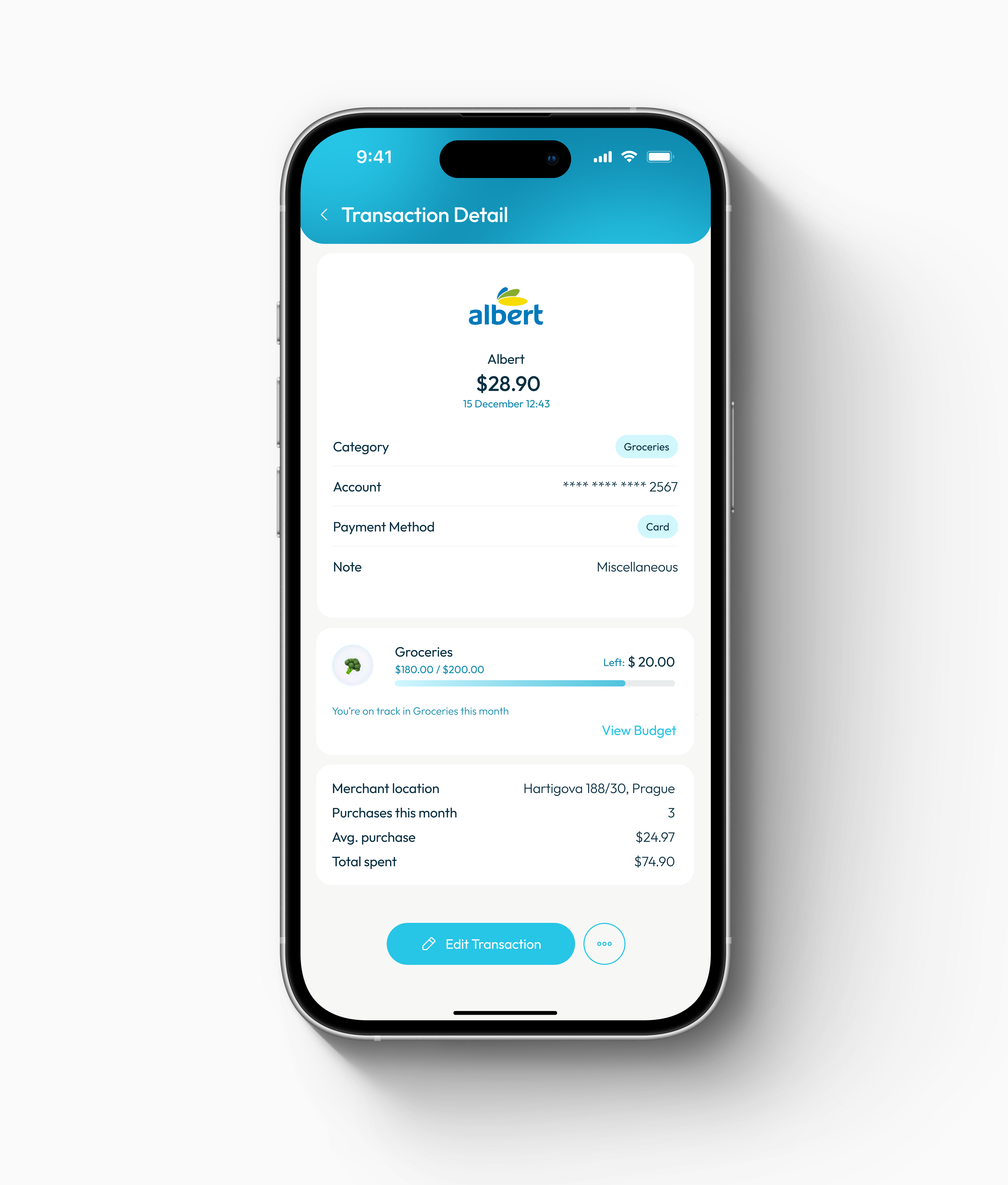
- Transactions are designed for scanning and quick edits (category, note, split); Transaction Detail includes a budget-impact card and a clear route back to Budget, so edits feel purposeful, not clerical.
- Where
- Transactions / Transaction Detail
Outcome
- A concept rather than a shipped product — but one framed on a real budgeting behaviour (short, frequent check-ins) instead of an assumed sit-down-and-budget session.
- Clear prioritisation without anxiety-driven design: the interface stays calm and still makes “what needs attention” unmistakable.
- Trust-building UX through fast correction and visible budget impact — the loop that keeps a budget accurate enough to rely on.
- A consistent component system and clean mobile hierarchy, with motion used purposefully to support readability rather than decorate.
What I Took From It
The hardest part of a calm product is restraint: the interface only earns the user's attention when something is actually wrong. Deciding what not to colour, not to surface, and not to advise did more for clarity than any feature I added.
A calm budgeting companion that makes the month legible in seconds — neutral by default, and loud only when a category actually overspends.
Self-initiated concept project.