TL;DR
- Owned all product design across three surfaces: candidate mobile app, employer web app, and a simple admin web app.
- The hard part: designing trust-critical flows on a client-mandated, only-partially-documented component kit I didn't pick — and keeping the product coherent across all three surfaces.
- Where it landed: shipped and built on the proposed system; the stakeholder was very satisfied, and used a Figma pitch prototype I built to win their first customer.
The Challenge
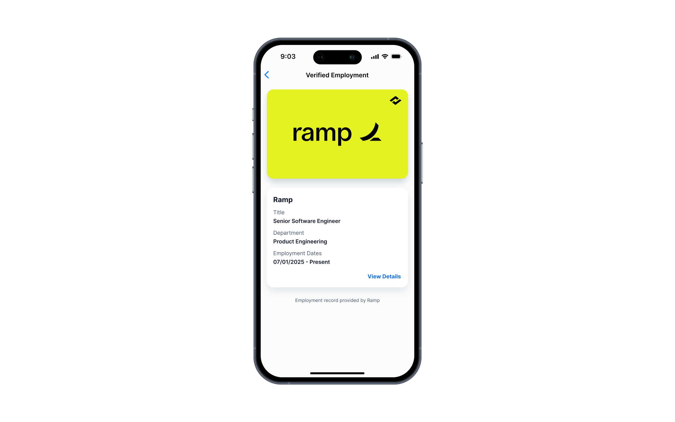
- The verification result moment has to read as trustworthy. "Verified / pending / under review / rejected" isn't cosmetic — the whole product is worthless if the user can't trust that state at a glance.
- The component kit was mandated, not chosen. The client required Minimals UI (a paid kit that skins Material UI). It diverges from stock Material UI in places, and several component docs are incomplete.
- Key interaction details were unsettled at kickoff, and scope covered three surfaces at once.
The Solution
- Settled the UX in person. Used a brief client visit from New York to close the open interaction questions face-to-face rather than in async threads — the fastest way to unblock an ambiguous kickoff and lock a shared direction.
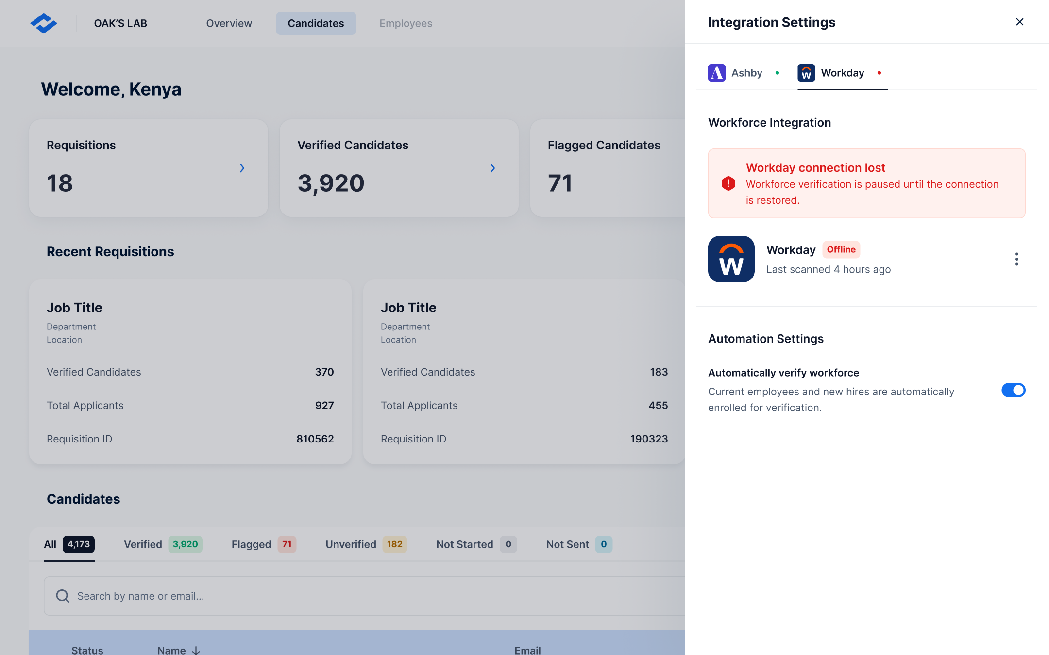
- Designed to the components that actually existed. Worked within the mandated kit's real (and sometimes under-documented) components so engineering could build straight from the designs instead of reverse-engineering them — trading some bespoke visual freedom for build fidelity and handoff speed.
- Solidified one direction. Then iterated across all three surfaces on that shared foundation.
Key Decisions
-
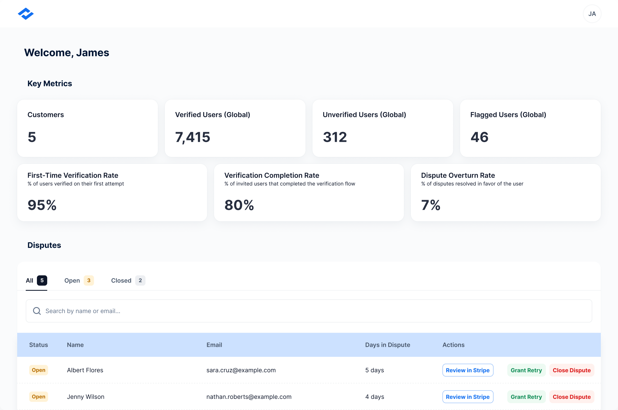
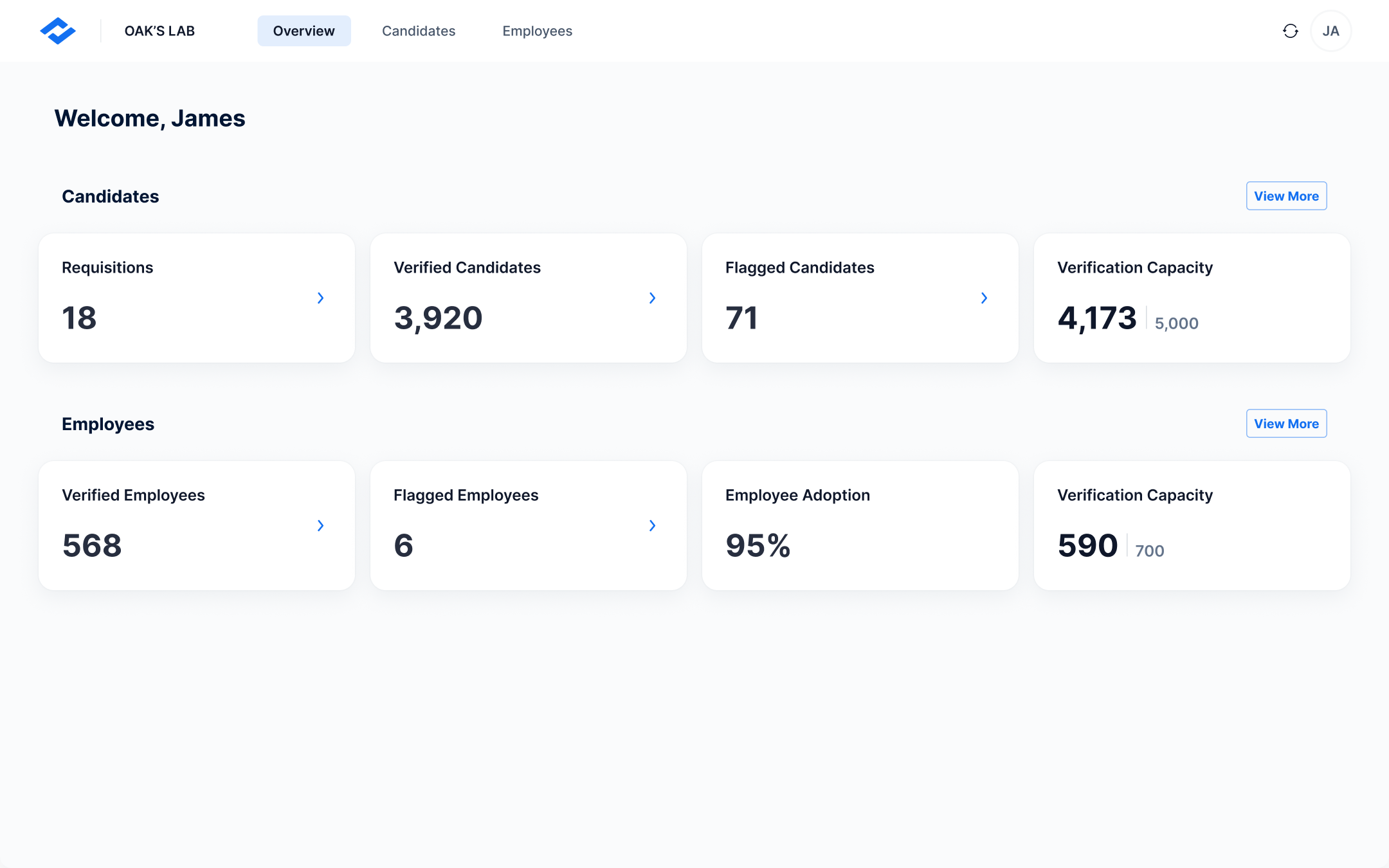
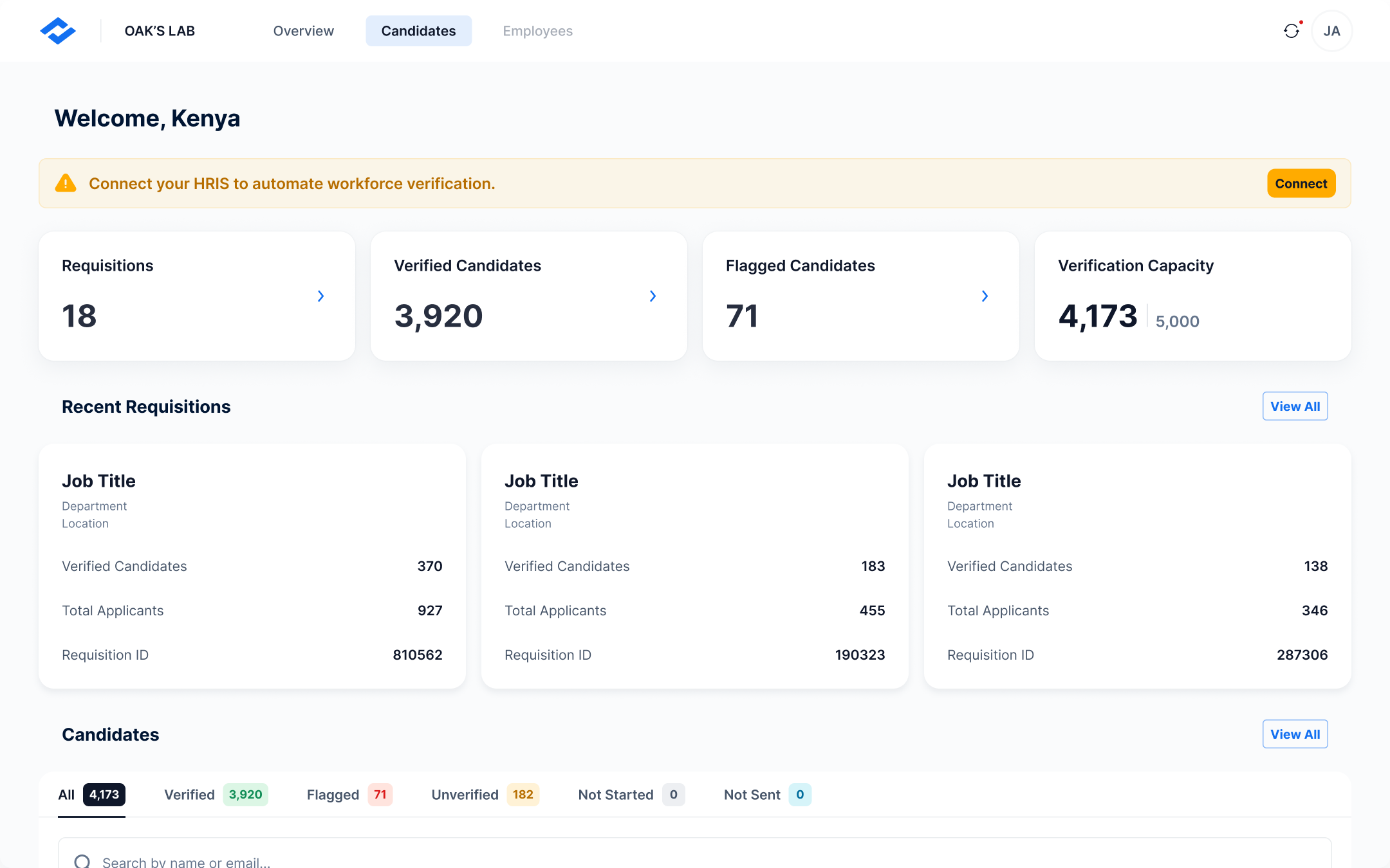
Gave a multi-entitlement web app one obvious place to start
- Problem
- Buyers can purchase workforce verification, candidate verification, or both — with no clear entry point for a "bought both" user.
- Decision
- Designed the overview dashboard as the single, unambiguous entry point that orients this user, instead of dropping them into one product arbitrarily or forcing an upfront choice.
- Where
- Employer web app — overview dashboard
-
Compressed ~10 home-screen states into one legible mobile surface
- Problem
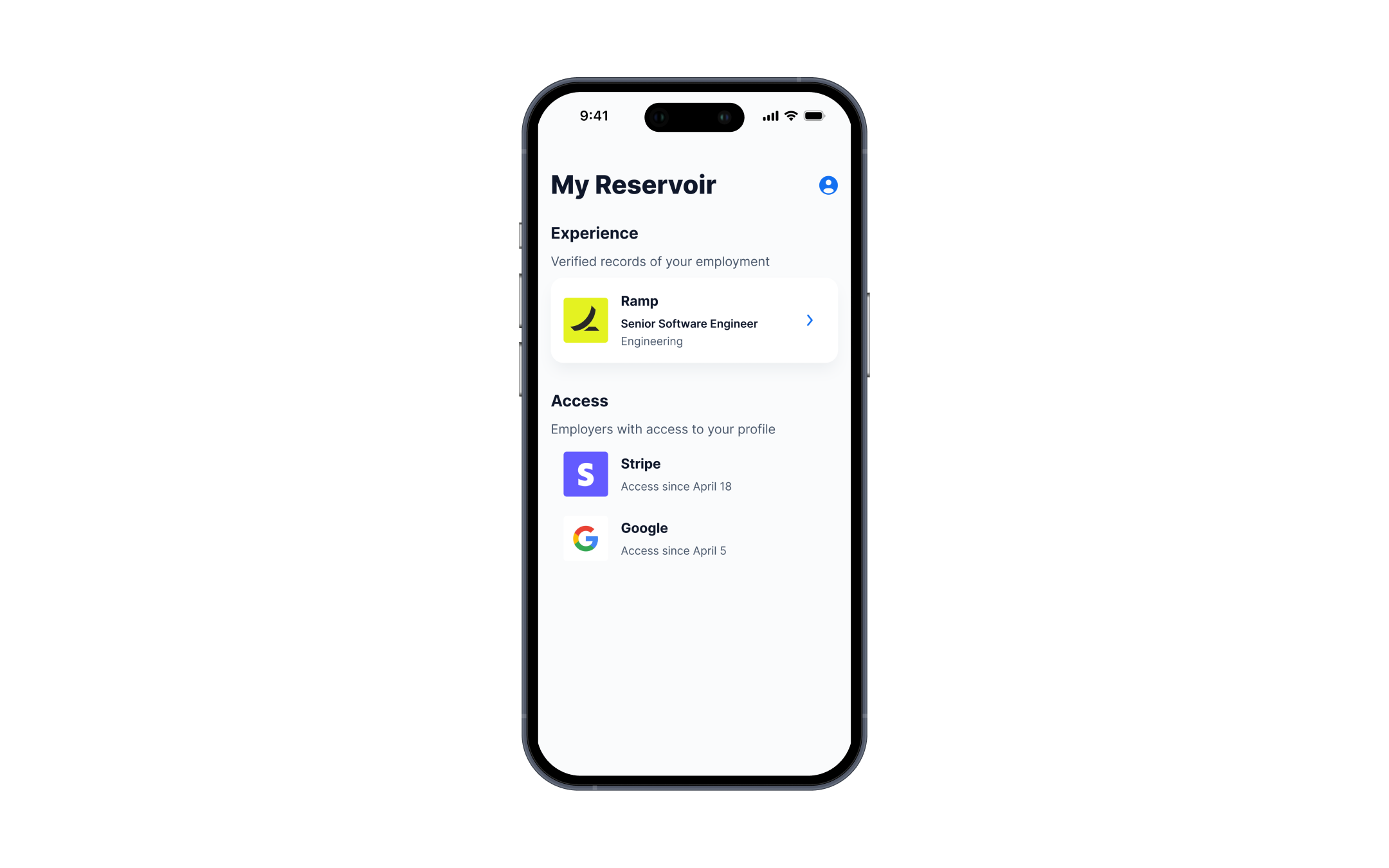
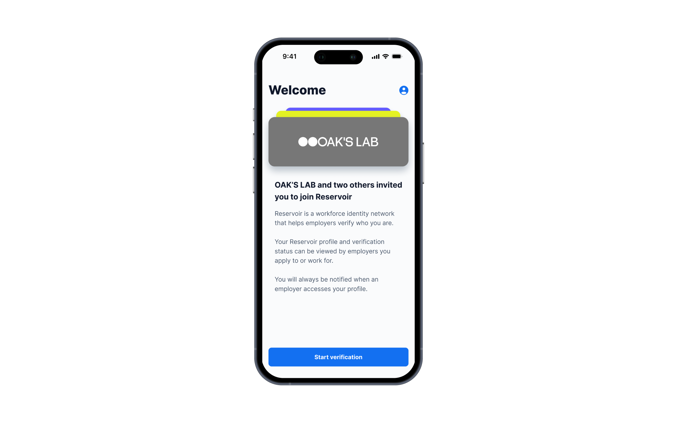
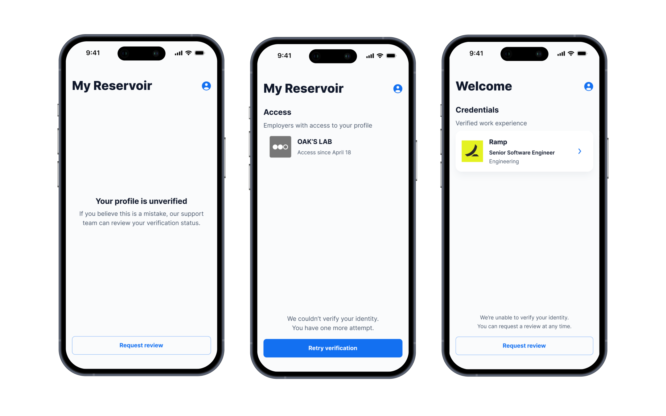
- The candidate home reflects many conditions (invited, empty, verified, pending, under review, not verified, re-verify…).
- Decision
- Modeled these as states of a single screen rather than a sprawl of separate screens, so the candidate's mental model stays simple no matter where they are in verification.
- Where
- Candidate mobile app — home screen
-
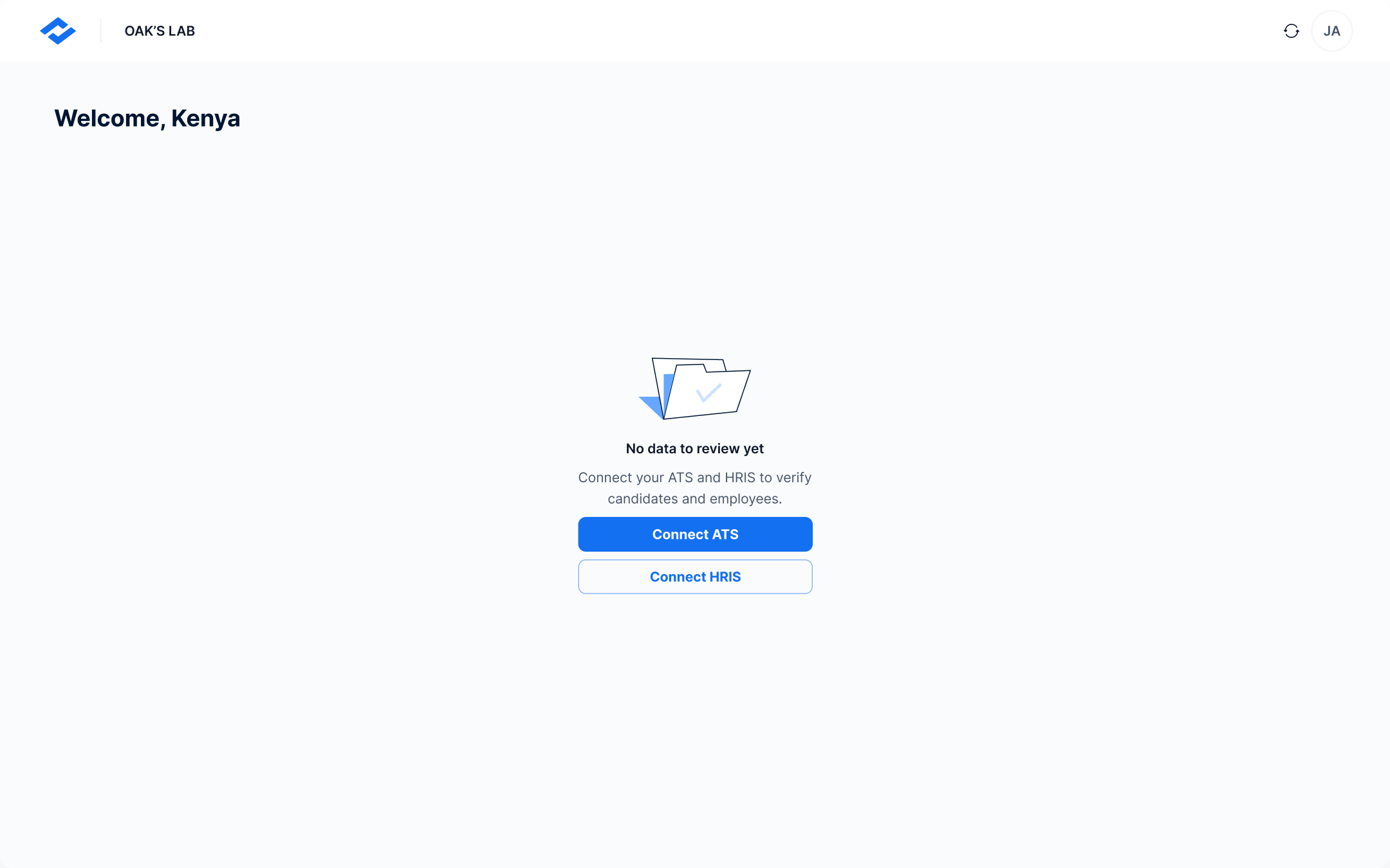
Turned empty states into onboarding
- Problem
- In software this niche, users land on empty screens before they fully grasp the product.
- Decision
- Designed each empty state to orient them and prompt the next action, rather than leave a dead-end blank page.
- Where
- All three surfaces — empty states
Outcome
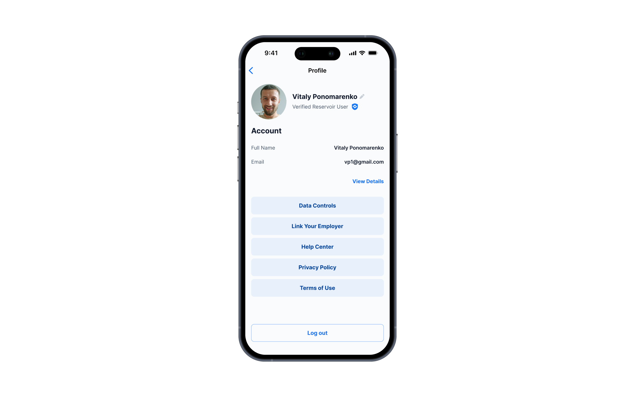
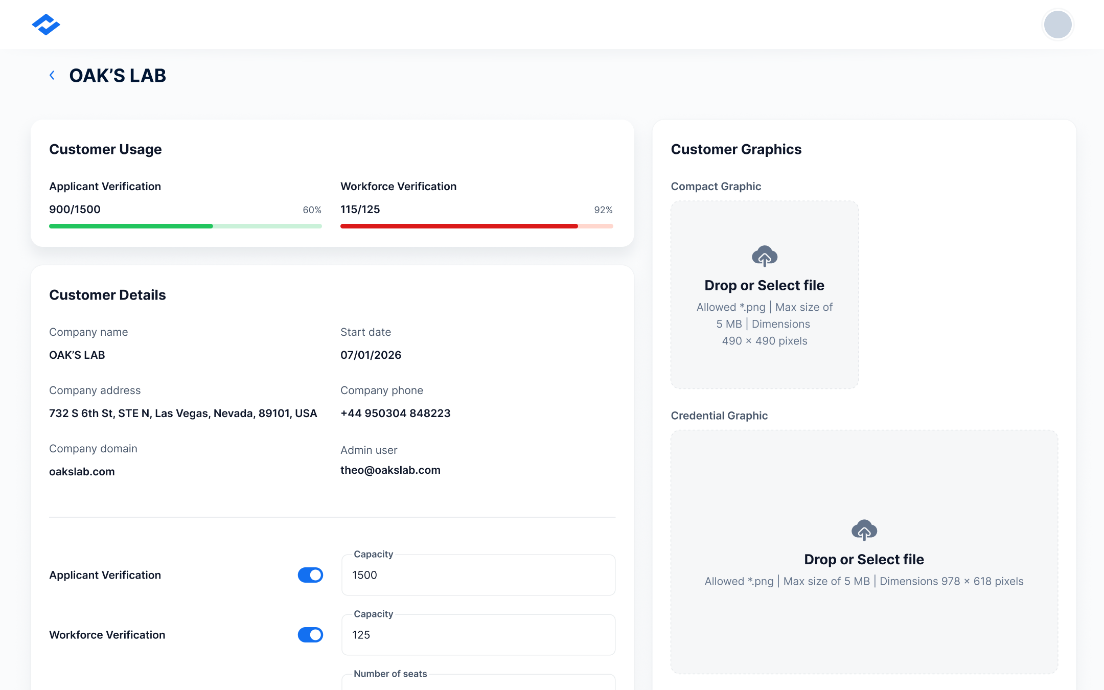
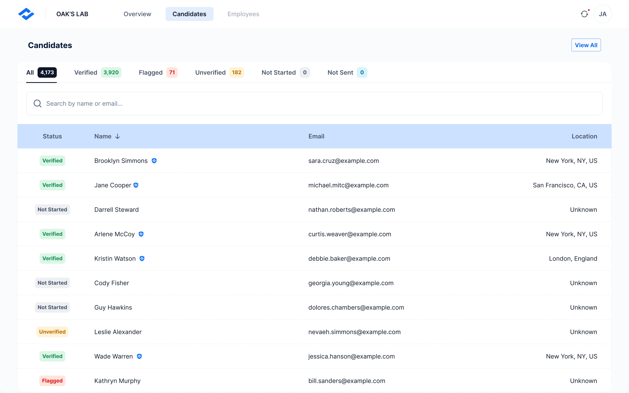
- All three apps shipped on the proposed system: a B2C candidate mobile app, a B2B employer web app, and an admin app.
- Filled the component kit's missing documentation as I designed, so its incomplete docs stopped blocking the build.
- The client stakeholder was very satisfied with the result.
- A Figma prototype I built for the client's sales pitch helped them land their first customer.
What I Took From It
Owning design across three surfaces on someone else's stack taught me that consistency is a systems problem, not a screen-by-screen one.
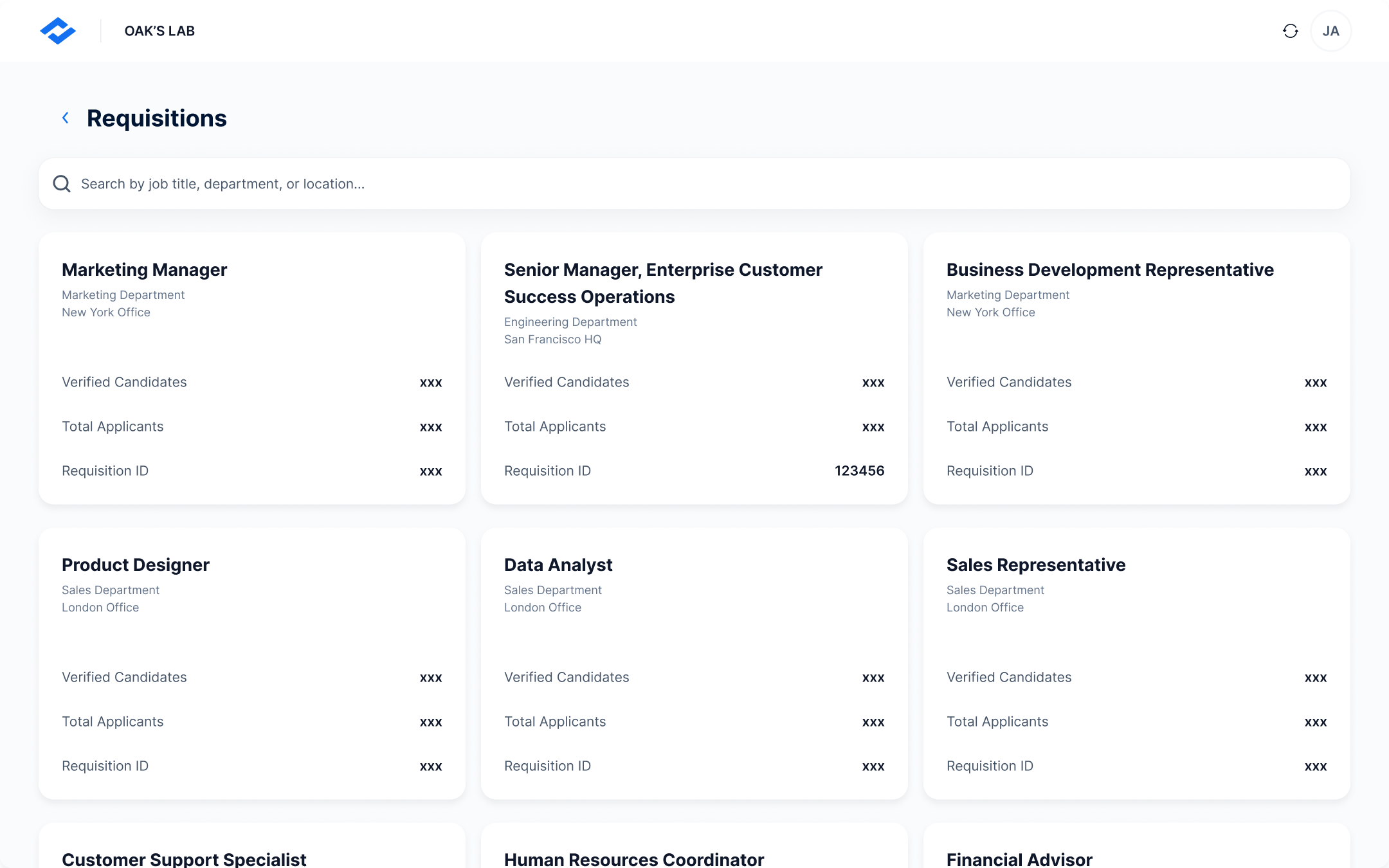
Trust-critical identity verification, designed across three surfaces on a client-mandated component kit — unblocked with an in-person kickoff and shipped to a very satisfied stakeholder.